Numéro de revue

LXIIe congrès annuel de l’AFSE, 2013

Revue d'économie politique
2014/4 Vol. 124


216 pages

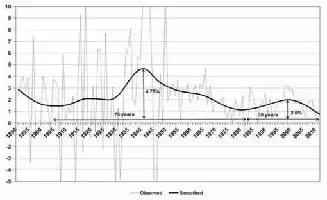
Graph 
Description de l'image par IA : Graph showing labor productivity growth in USA, 1891-2012.

Average annual growth rate of labour productivity per hour in the USA Observed and smoothed indicator Whole economy – 1891-2012 – In %

Smoothed indicator through Hodrick-Prescott filtering (? = 500).

Bergeaud, Cette and Lecat [2014].
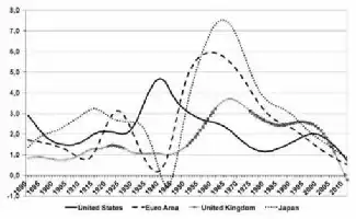
Graph 2
Description de l'image par IA : Line graph showing labor productivity growth rates from 1891 to 2012 for USA, Euro Area, UK, and Japan.

Average annual growth rate of labour productivity per hour in the USA, the Euro Area, The United Kingdom and Japan Smoothed indicator Whole economy – 1891-2012 – In %

Smoothed indicator through Hodrick-Prescott filtering (? = 500).

Bergeaud, Cette and Lecat [2014].The Euro Area is here the aggregation of Germany, France, Italy, Spain, The Netherlands, and Finland. These six countries represent together, in 2012, 85¼ % of the total GDP of the Euro Area.
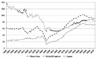
Graph 3
Description de l'image par IA : Line graph showing productivity levels from 1890 to 2012 for Euro Area, UK, and Japan relative to the US.

Level of productivity per hour relative to the current US level, in the Euro Area, The United Kingdom and Japan Whole economy – 1890-2012 – § 2005 ppp – In % of the US level

Bergeaud, Cette and Lecat [2014].The Euro Area is here the aggregation of Germany, France, Italy, Spain, The Netherlands, and Finland. These six countries represent together, in 2012, 85¼ % or the total GDP of the Euro Area.
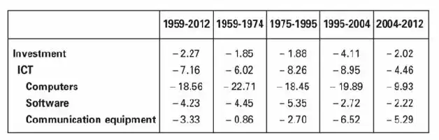
Figure
Table showing changes in various economic indicators across five time periods from 1959 to 2012.
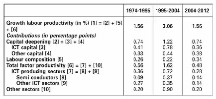
Figure
Table showing labor productivity growth and contributing factors from 1974-1995, 1995-2004, and 2004-2012.
Graph 4
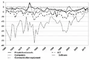
Description de l'image par IA : Line graph showing investment growth rates from 1960 to 2010.

Annual growth rate of investment price relative to GDP price In the USA – 1960-2012 – In %

BEA.

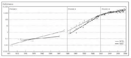
Graph 5
Description de l'image par IA : Graph showing microprocessor performance growth from 1971 to 2009 for INTEL and AMD.

Growth of microprocessors performance Microprocessors produced by INTEL and AMD – 1971-2009

Pillai [2011].

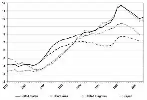
Graph 6
Description de l'image par IA : Line graph showing ICT capital coefficient from 1970 to 2009 for the U.S., Euro Area, U.K., and Japan.

ICT capital coefficient (x100), at current prices (Ratio of ICT capital stock to GDP in current prices) Scope: The whole economy – 1970-2009

Cette and Lopez [2012].The Euro Area is here the aggregation of Germany, France, Italy, Spain, The Netherlands, Austria and Finland. These seven countries represent together, in 2012, 88½ % or the total GDP of the Euro Area.
Figure
Description de l'image par IA : A table comparing percentages of US and foreign companies from 1971-1989 and 1990-2008.
Graph 7
Description de l'image par IA : Bar chart comparing ICT capital coefficients among Euro Area, UK, and Japan.

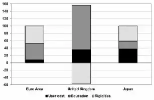
Sources of ICT capital coefficient gap with the US in 2008 Whole economy – In % of the gap

Cette and Lopez [2012].The Euro Area is here the aggregation of Germany, France, Italy, Spain, The Netherlands, Austria and Finland. These seven countries represent together, in 2012, 88½ % or the total GDP of the Euro Area.

Figure
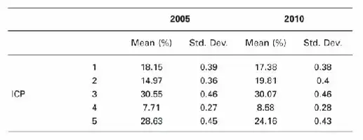
Table comparing ICP percentages and standard deviations for years 2005 and 2010.
Figure
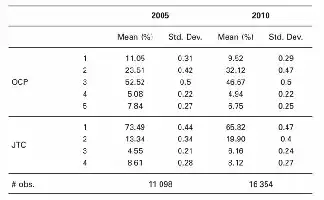
Table comparing percentages and standard deviations for OCP and JTC in 2005 and 2010.
Figure
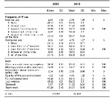
Table comparing IT use and workplace factors between 2005 and 2010, including means, standard deviations, and frequency distributions.
Figure
Table with statistical data comparing IT use, NOP, and employee/job characteristics between 2005 and 2010.
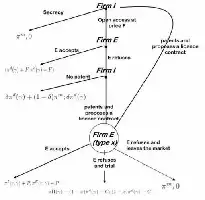
Figure 1
Description de l'image par IA : A flowchart depicting interactions between two firms, patent processes, and market outcomes.

The game

Graph 1
Description de l'image par IA : Chart showing infringement and trial processes with time intervals and outcomes.
Figure
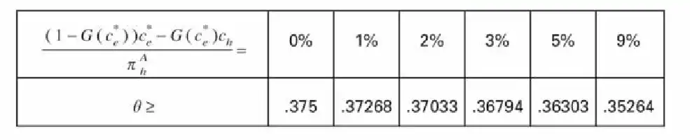
Description de l'image par IA : A table with mathematical expressions and corresponding numerical values. The table includes percentages and their respective values.
Figure
Description de l'image par IA : Table with mathematical formula and corresponding values.
Figure
Table of regression analysis results with coefficients, standard errors, and group sizes over different years.
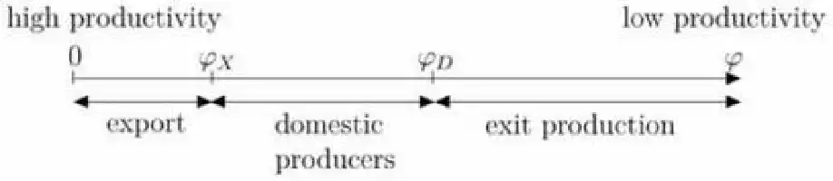
Figure 1
Description de l'image par IA : A horizontal line with markers indicating productivity levels from low to high, labeled for export, domestic producers, and exit production.

Cutoff values and the self-selection

Figure 2
Description de l'image par IA : A graph showing a curve that starts high on the left and gradually flattens out as it moves to the right.

Low entry barrier scheme with fX = 0.1

Figure 3
Description de l'image par IA : Graph showing two curves on a coordinate plane with γ on the x-axis and φ% on the y-axis. One curve is flat, the other rises and levels off.

High entry barrier scheme with fX = 2.1

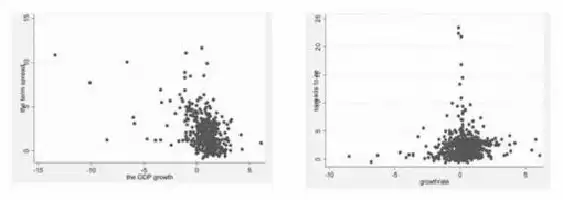
Figures 1 and 2
Description de l'image par IA : Two scatter plots showing the relationship between term spread and GDP growth rates in EU countries.

The evolution of the term spread and GDP growth rates in EU countries

Note: The Y scale represents the term spread while the X scale represents the GDP growth rates.
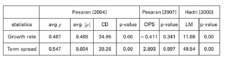
Figure
Table comparing statistical data from three studies: Pesarani (2004), Pesarani (2007), and Hadri (2000).
Figure
Table with statistical values and p-values from a 2007 study by Westerlund.
Figure
Table of statistical data comparing growth rate and term spread across different studies and years.
Figure
Table showing statistical data with periods, terms, and observations.
Figure
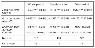
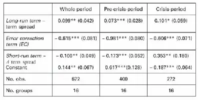
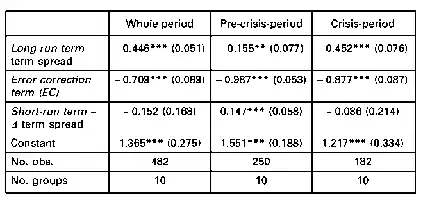
Table with statistical data for different periods: Whole, Pre-crisis, Crisis. Includes terms and observations.
Figure
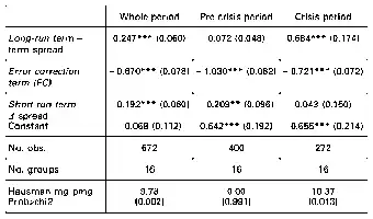
Table with statistical data across three periods: Whole, Pre-crisis, Crisis. Includes terms, constants, observations, and Hausman tests.
Figure
Table with statistical data and periods.
Figure
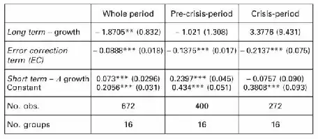
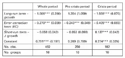
Table with statistical data on long-run term growth and error correction term across different periods.
Figure
Table with statistical data and periods.
Figure
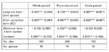
Table with statistical data and coefficients.
Figure
Table with statistical data and periods.
Figure
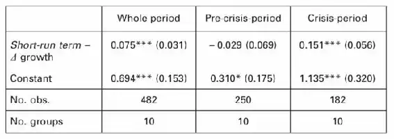
Table with statistical data on economic growth periods.
Figure 1
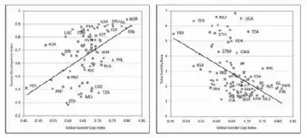
Description de l'image par IA : Two scatter plots comparing Gender Gap Index with Human Development Index and Total Fertility Rate in 2006.

Relation of Gender Gap Index with Human Development Index and Total Fertility Rate in 2006

Note: Data are available for 114 countries.

World Bank

Figure 2
Description de l'image par IA : Six graphs showing economic and social trends in France from 1740 to 2008.

Transformations of the French Profile during the Development Process

Note: Missing values are interpolated by linear interpolation.

(a) Maddison [2008]; (b) Chesnais [1991]; (c) Henry and Houdaille [1979] – INSEE; (d) Marchand and Thélot [1997]; (e) Diebolt; (f) Own calculations using data from Marchand and Thélot [1997].
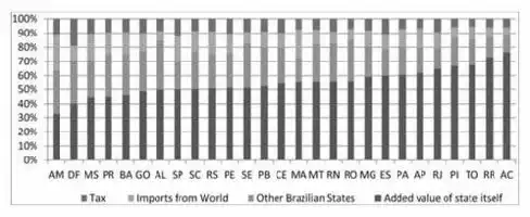
Graph 1
Description de l'image par IA : Bar graph showing Brazilian states' gross exports in 2008.

Breakdown of Brazilian states’ gross exports (2008)

Acre: AC; Alagoas: AL; Amazonas: AM: Amapa: AP; Bahia: BA; Ceara: CE; Distrito Federal: DF; Espirito Santo: ES; Goias: GO; Maranhao: MA; Minas Gerais: MG; Mato Grosso Do Sul: MS; Mato Grosso: MT; Para: PA; Paraiba: PB; Pernambuco: PE; Piaui: PI; Parana: PR; Rio De Janeiro: RJ; Rio Grande Do Norte: RN; Rondonia: RO; Roraima: RR; Rio Grande Do Sul: RS; Santa Catarina: SC; Sergipe: SE; Sao Paulo: SP; Tocantins: TO.

2008 Inter-State Input-Output Table calculated in association with J. Guilhoto (USP) based on the NEREUS database. Some elements are available on http:// guilhotojjmg.wordpress.com/banco-de-dados/matrizes-nacionais-2/
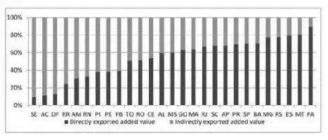
Graph 2
Description de l'image par IA : Bar chart showing the percentage of directly and indirectly exported value-added by various states.

Indirectly and directly exported value-added of states ( %)

2008 Inter-State Input Output Table calculated by J. Guilhoto at USP.
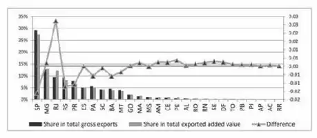
Graph 3
Description de l'image par IA : Graph showing the share of total gross exports and exported added value by states in Brazil, with differences highlighted.

States’ gross exports and value-added share in Brazilian total ( %)

2008 Inter-State Input Output Table calculated by J. Guilhoto at USP.

Figure
Table listing variables for efficiency scores and main explaining variables with definitions and sources.
Figure
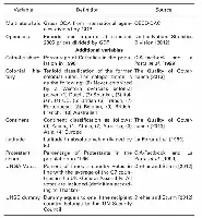
Table listing variables, definitions, and sources for a study. Includes variables like Multilateral aid, Openness, Catholic share, and more.
Figure
Table with variables, observations, means, and standard deviations.
Figure
Table comparing statistical models for different types of aid.
Figure
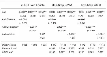
Table comparing statistical effects of aid on finance, democracy, and inflation.
Figure 1
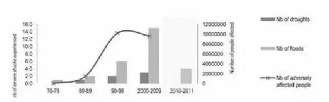
Description de l'image par IA : Graph showing trends in droughts, floods, and affected people in Malawi from 1970 to 2011.

Droughts and floods trends between 1970 and 2011 in Malawi

“EM-DAT: the OFDA/CRED International Disaster Database, Université Catholique de Louvain, Bruxelles. www.emdat.be.

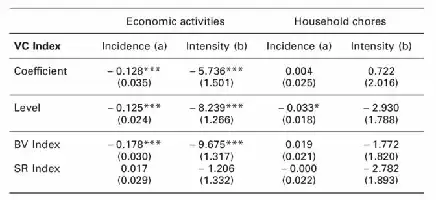
Figure
Table showing incidence and intensity of economic and domestic activities across different demographics.
Figure
Table with coefficients for economic and household activities.
Figure
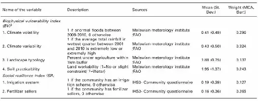
Table listing variables, descriptions, sources, means, and weights for biophysical vulnerability and social resilience indices.
Figure
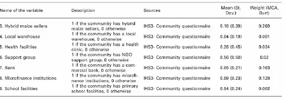
Table listing community resources with descriptions, sources, means, and weights.
Figure
Table listing variables of interest with descriptions, means, and standard deviations.
Figure
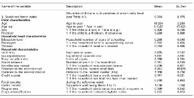
Table listing variables with descriptions, means, and standard deviations for social and economic data.
Figure
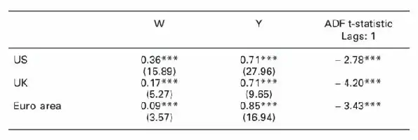
Table showing statistical data for US, UK, and Euro area with W, Y, and ADF t-statistic values.
Figure
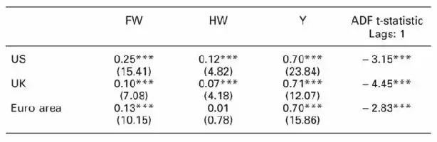
Table showing statistical data for US, UK, and Euro area with FW, HW, Y, and ADF t-statistic values.
Figure 1
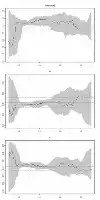
Description de l'image par IA : Three line graphs showing trends over time with shaded confidence intervals.

OLS and quantile regressions: Evidence for the US (consumption, asset wealth and labour income).

Figure 2
Description de l'image par IA : Four graphs showing regression trends for consumption, financial wealth, housing wealth, and labor income.

OLS and quantile regressions: Evidence for the US (consumption, financial wealth, housing wealth and labour income).

Figure
Table with statistical data including quantiles, W, Y, FW, HW, and corresponding p-values.
Figure 3
Description de l'image par IA : Three line graphs showing trends over time, with shaded areas indicating variability.

OLS and quantile regressions: Evidence for the UK (consumption, asset wealth and labour income).

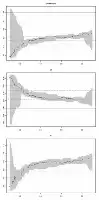
Figure 4
Description de l'image par IA : Four line graphs showing trends for consumption, financial wealth, housing wealth, and labor income in the UK.

OLS and quantile regressions: Evidence for the UK (consumption, financial wealth, housing wealth and labour income).

Figure
Table showing statistical data with quantiles, W, Y, FW, HW, and Y values. Includes p-values from tests.
Figure 5
Description de l'image par IA : Three line graphs showing trends over time.

OLS and quantile regressions: Evidence for the euro area (consumption, asset wealth and labour income).

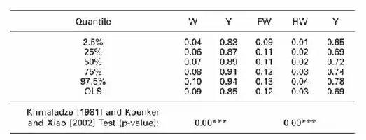
Figure 6
Description de l'image par IA : Four line graphs showing trends over time for consumption, financial wealth, housing wealth, and labor income in the euro area.

OLS and quantile regressions: Evidence for the euro area (consumption, financial wealth, housing wealth and labour income).

Figure
Table with statistical data and p-values.
Figure
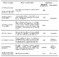
Table categorizing ownership types of firms with main characteristics, degree of involvement, and time horizon.
Figure
Table showing compensation data for various sectors and roles.
Figure
Table showing compensation data and its sensitivity to annual performance, categorized by ownership sectors.
Figure
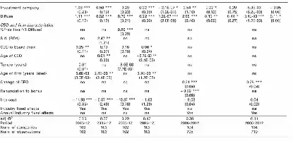
Table of statistical data with coefficients and significance levels for various corporate and financial metrics.