Recent searches
Suggestions for you
No suggestions found
* Required fields
Not registered yet?
Sign up You will be redirected to the sign-up form to create a new account
Logged out
Humanities and Social Sciences
Science, Technology and Medicine
Law and Administration
Hérodote 2013/2 No 149
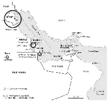
Us Military Bases in the Persian Gulf
Votes in the 2008 and 2012 Presidential Elections
Obama’s Performance in 2008 and 2012
Butler S wing Score
Difference in Voter Turnout in the 2008 and 2012 Presidential elections
Proportion of Hispanics in the Total Population in 2010
Results of the 2012 Presidential Election in Florida
Proportion of African-Americans in the Total Population of Florida in 2010
Butler Swing Score for the 2012 Presidential Election
Proportion of Hispanics in the Total Population of Florida in 2010
Distribution of Campaign Spending on Televised ADS, 2012
Proportion of White Working-Class Voters in the Total Working Population in 2010
Results of the 2012 Presidential Election in Ohio
Difference in Voter Turnout in the 2008 and 2012 Presidential Elections
Butler Swing Score for Ohio, 2008-2012
Proportion of Young Voters (18-29) in the Total Population in 2010
Search